King’s Table
A poker app for home games: the clock, who has paid, the payouts and the season ranking in one place.
- Landing page live with a waiting list; the app sits behind the login
- 8 areas and 106 features described on the landing page
- 22 test suites in the app, from the clock to offline sync
- 10 tables with RLS: each account only ever sees its own nights
How it worked before.
A home game among friends runs on a spreadsheet and memory. Someone times the blinds on their phone, someone else notes on paper who has already paid, and at the end of the night the payouts are worked out in someone’s head with the whole table waiting.
What gets lost is not one night’s arithmetic: it is the season. Who won most this year, who has owed since April, which blind structure made the night end on time. None of it survives to the next gathering.
What changed.
The product has two halves. The landing page pitches it and holds a spot on the waiting list; the app is where the night happens, with the blind clock, buy-ins and rebuys, settling up, payouts worked out on the spot, and the league ranking closing itself every time a night ends.
The clock was the stubborn part. It has to stay right with the screen locked and the app in the background, which is exactly where this kind of app fails mid-table. 22 test suites hold up what cannot break, and a good share of them cover offline sync: the queue of operations, a conflict between two devices, and recovery after the connection drops.
The landing page and the app live at the same address, and that was a decision, not an accident. The session lives in a cookie, and a cookie does not cross two vercel.app subdomains. Serving the app inside the landing page itself, at /app, is what made the login work end to end without having to buy a domain.
A look inside.
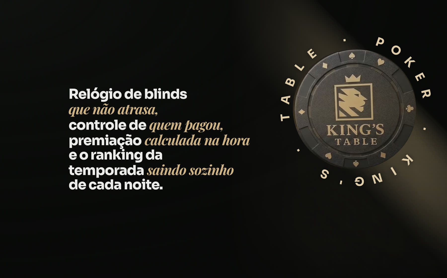
The promise said in a single sentence, beside the 3D chip that turns as the page scrolls. A clock that does not fall behind, a record of who paid, payouts worked out on the spot and a ranking that writes itself: the four pains of the night, in the order they turn up. 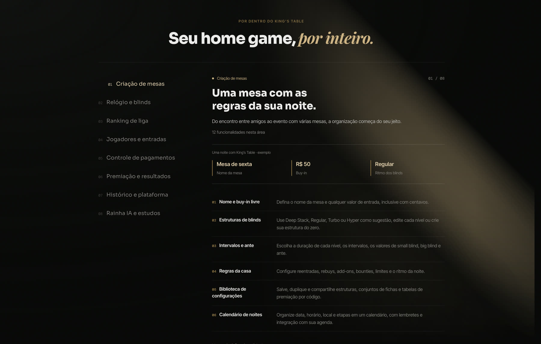
There are 106 features split across eight areas, and listing them all at once would become a wall of text. Here the list stays on the side and only one area opens at a time, with a worked example of a table above it so people see what it is about before reading the twelve items. 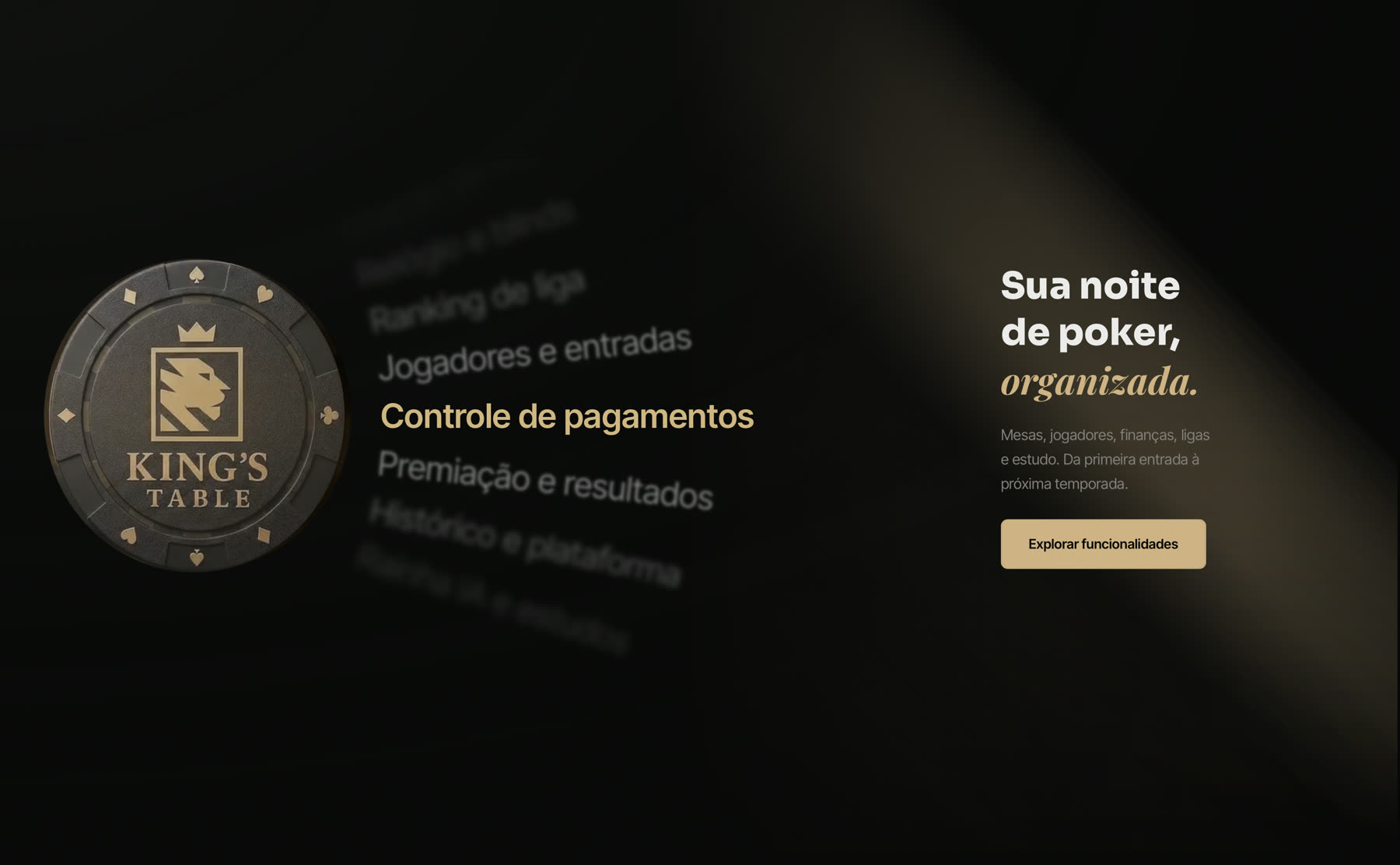
The same chip comes back as the anchor of the navigation: the areas slide past it at an angle and only the one in focus stays readable. It is the same idea as the carousel I use on the façade sites, applied to an index, so the eye knows where it is without a progress bar. 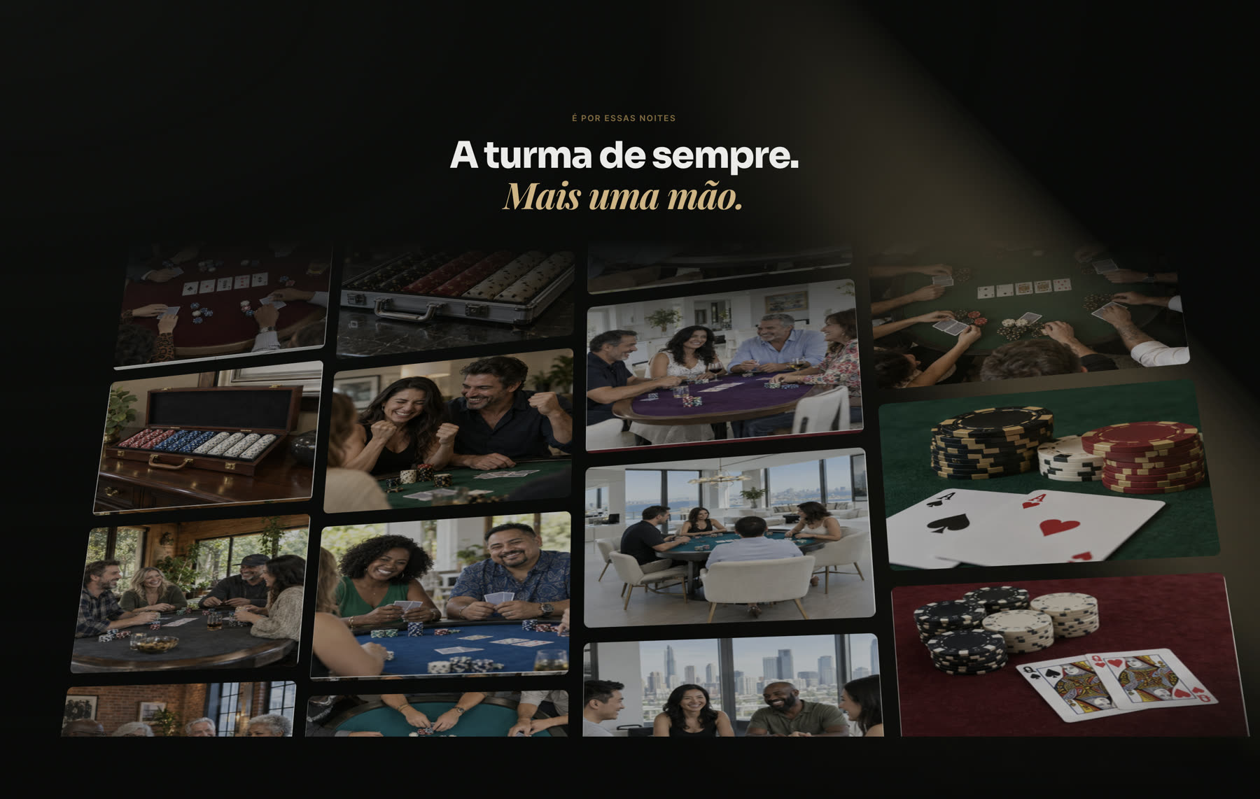
The mosaic is there to say who the product belongs to. It is not a casino floor or a professional tournament: it is the usual crowd, at the table in the living room, and the photo makes that point faster than any paragraph would. 
The last screen is the table seen from above, with the invitation on the felt. Since the product has not opened yet, it does not try to sell: it holds a spot on the waiting list, which is the only honest thing to ask for before launch.