Dr. Alípio Vigolvino
Website for a physician in adult mental health: for people who keep everything running on the outside but notice they are not well, and need a short path to an appointment.
- In development, published at a provisional Vercel address
- Seven pages in Astro, with no React or animation library sent to the browser
- Lighthouse on mobile: 98 performance and 100 accessibility on the home page
- Forced recalculation on scroll: from 4.3 ms to 0.02 ms per frame after merging the effects into a single loop
How it worked before.
Dr. Alípio sees adults with anxiety, low mood and trouble concentrating, online and in person. His audience is people who work, keep their commitments and nobody notices anything, but end the day exhausted. That person takes a long time to seek help because they think what they feel is not serious enough yet.
The site had to speak to them without diagnosing anyone through a symptom list, without promising results and within medical advertising rules. And it had to end in one simple gesture: messaging the front desk on WhatsApp.
What changed.
The home page follows the order in which the person decides: first they recognise themselves in four situations, then they understand that similar symptoms can have different causes, see what the follow-up is like and the path to booking, and only then meet who will see them. Each page opens WhatsApp with a message that already says where the person came from.
At two points scrolling drives the screen. The five steps move sideways while the page stays pinned, and a short video of the physician advances frame by frame as the window opens. The video became 52 images drawn on a canvas, about 1 MB on large screens and less than half of that on phones, downloaded only when the section gets close. Whoever asks the system for less motion sees the final frame, still.
The first version had too many effects and it stuttered. I measured inside the page itself: the effects alternated reading positions and writing styles within the same frame, which cost 4.3 ms of forced recalculation per frame on a fast computer. I moved everything into a single loop that reads first and writes after, and the cost dropped to 0.02 ms. Then the physician himself asked for less animation, and only what helps reading stayed.
A look inside.
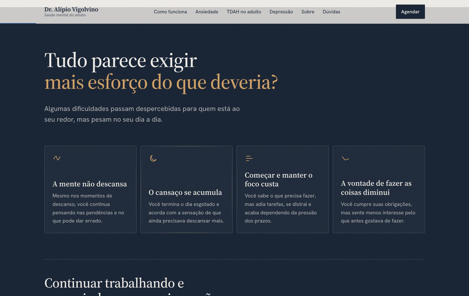
The person recognises themselves in four everyday situations, before any diagnosis is named. The card border lights up near the cursor. 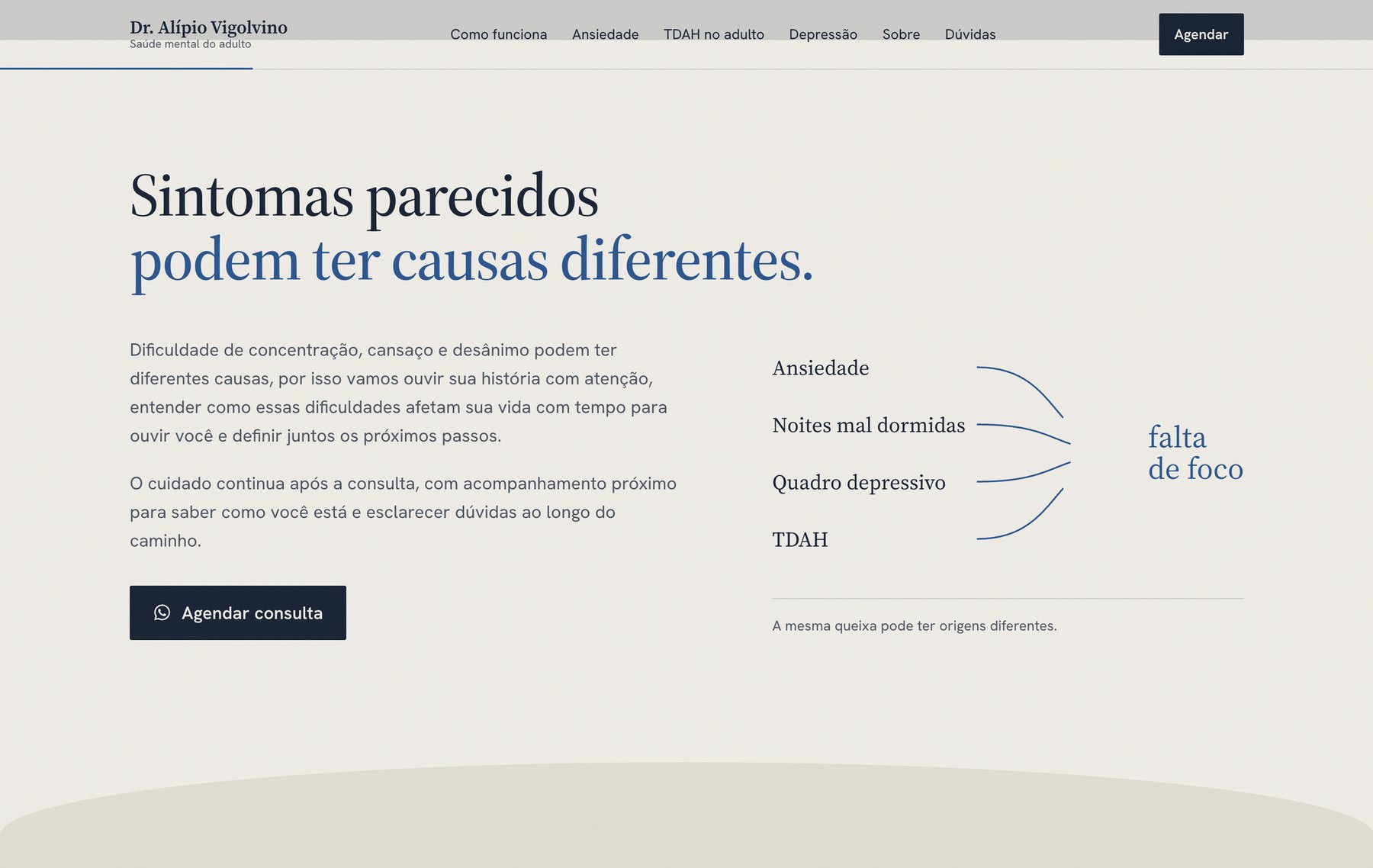
The physician’s core argument in one drawing: the same complaint can come from four sources, and telling them apart is what the appointment is for. 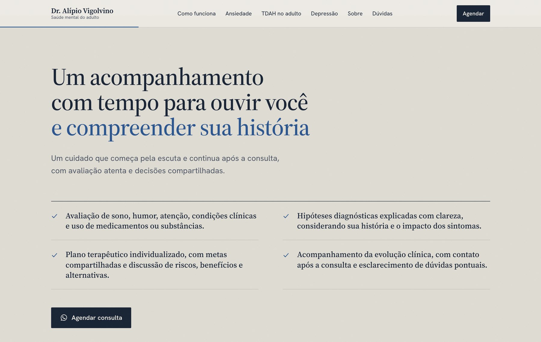
What the appointment includes, in four sentences. The copy in this version came from the physician himself. 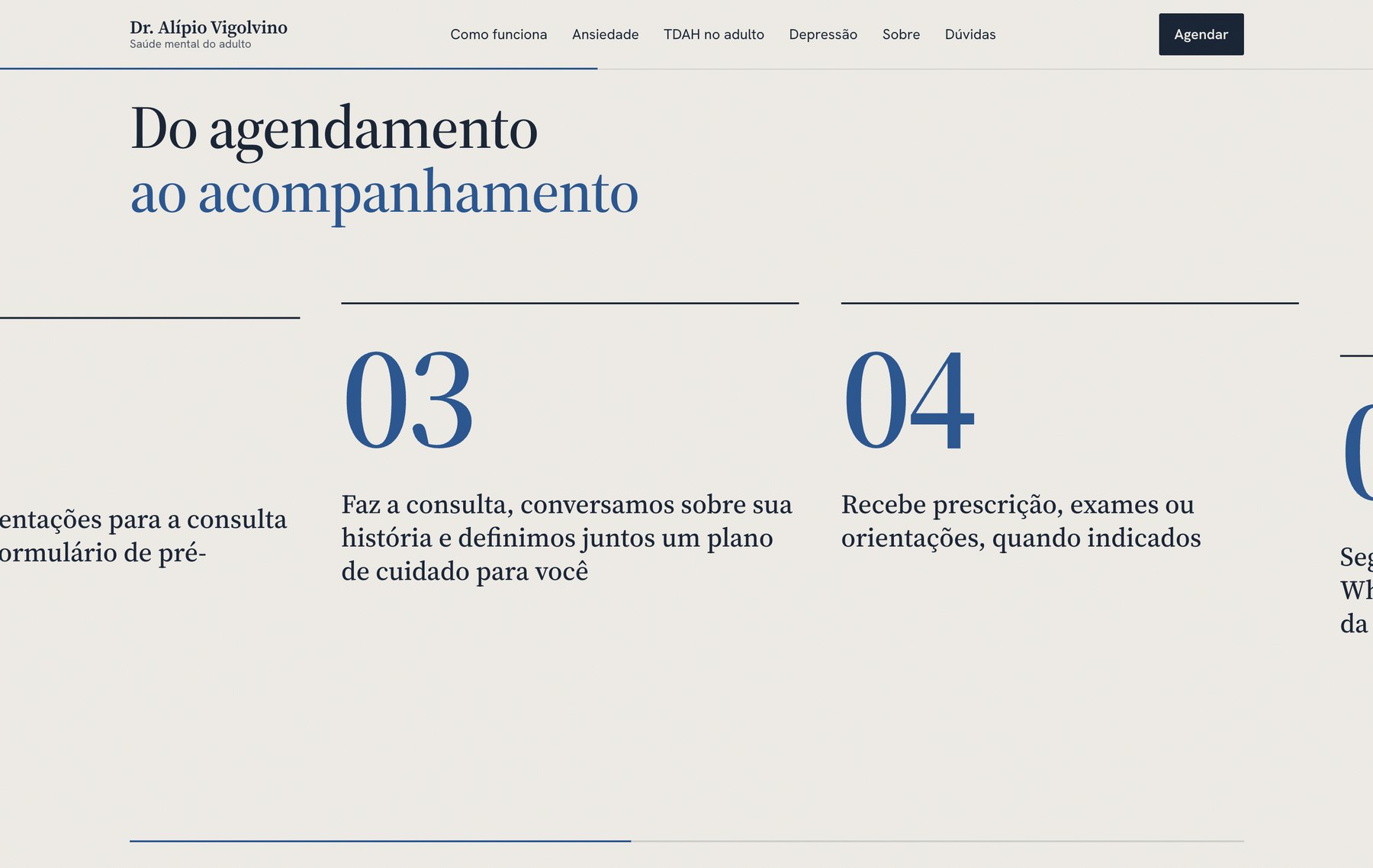
From booking to follow-up in five steps. The page stays pinned and scrolling moves the steps sideways. 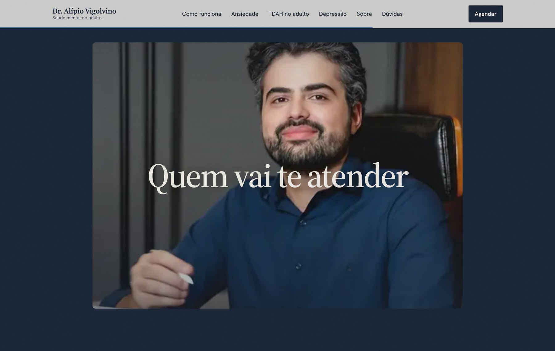
The video starts in a small window, with him looking down and writing. Scrolling opens the window and advances the video at the same time. 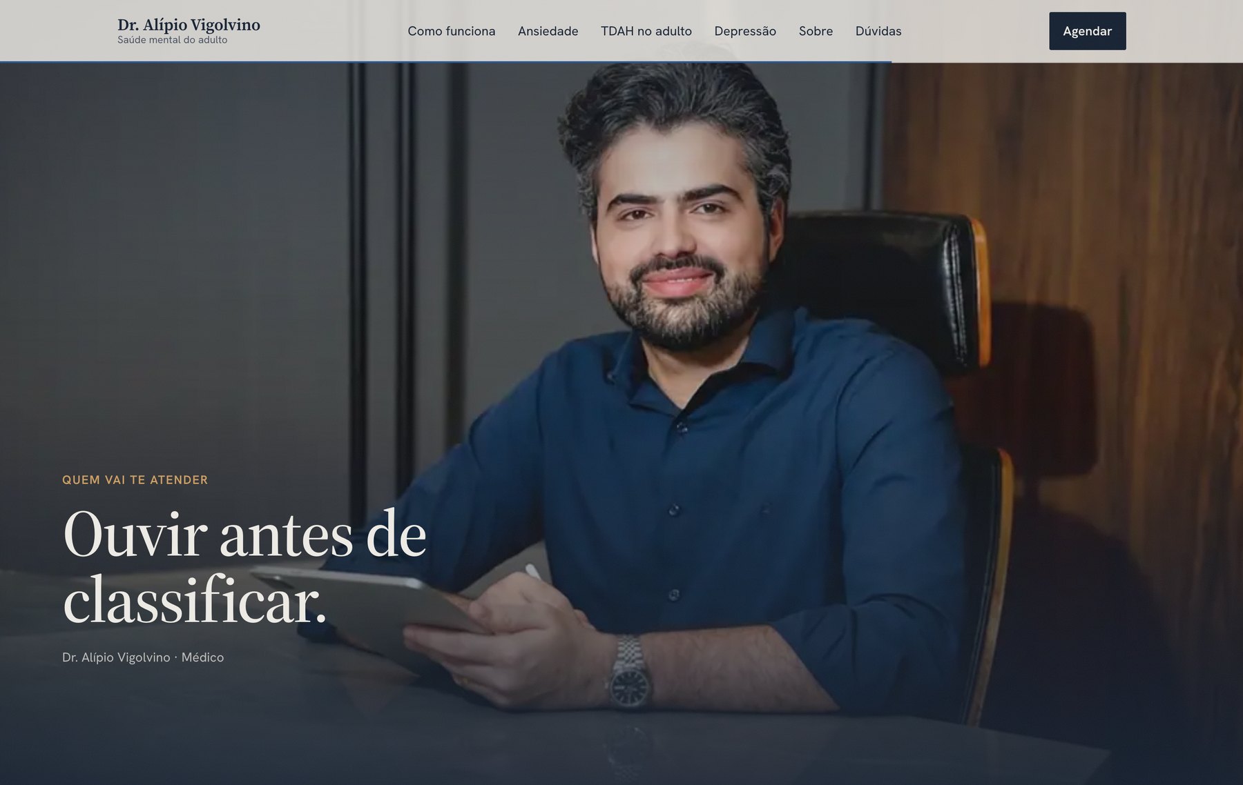
At full screen he has already looked up, and the line comes in. It is 52 images drawn on a canvas, downloaded only when the section gets close. 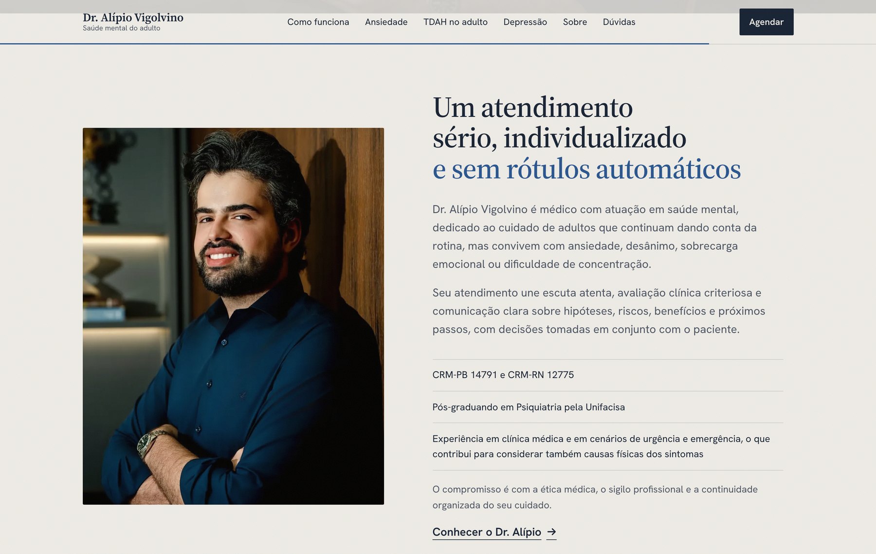
The introduction follows medical advertising rules: physician, both licence numbers and the ongoing training, with no specialist title. 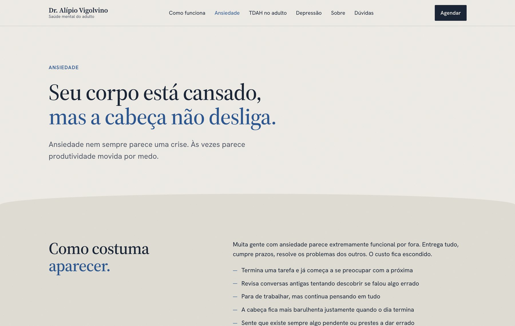
Each topic has its own page, written from what the person feels and not from a list of symptoms.