Dashboard Financeiro
Sales dashboard for the board: 138 months of revenue across three companies, with 18 comparative analyses ready to use.
Every number, client name and route in this case is FICTITIOUS, produced by a script written for that purpose. The system is real and in use, but its data is a company’s revenue and client base, and that does not belong in a portfolio. The fake dataset preserves the real one’s internal relations (ticket is revenue divided by orders, daily figures add up to the month), so what you see here is how the dashboard behaves, not anyone’s actual operation.
- Fictitious data: the system is real, the numbers are not
- 138 months consolidated across three companies, from 11/2021 to 04/2026
- 18 comparative analyses, from Pareto 80/20 to retention cohorts
- Runs locally, with nothing leaving the machine of whoever uses it
A look inside.
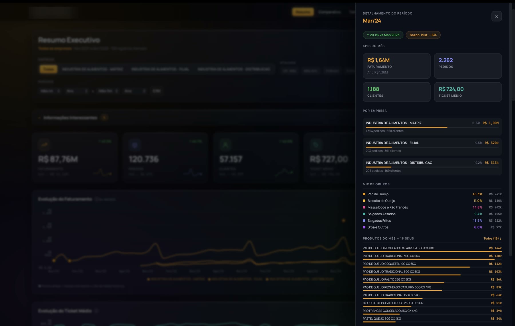
Clicking any point on the chart opens the month from the inside: what each company made, the mix by product line and the SKUs sold, without leaving the screen. That question used to turn into a brand new spreadsheet. 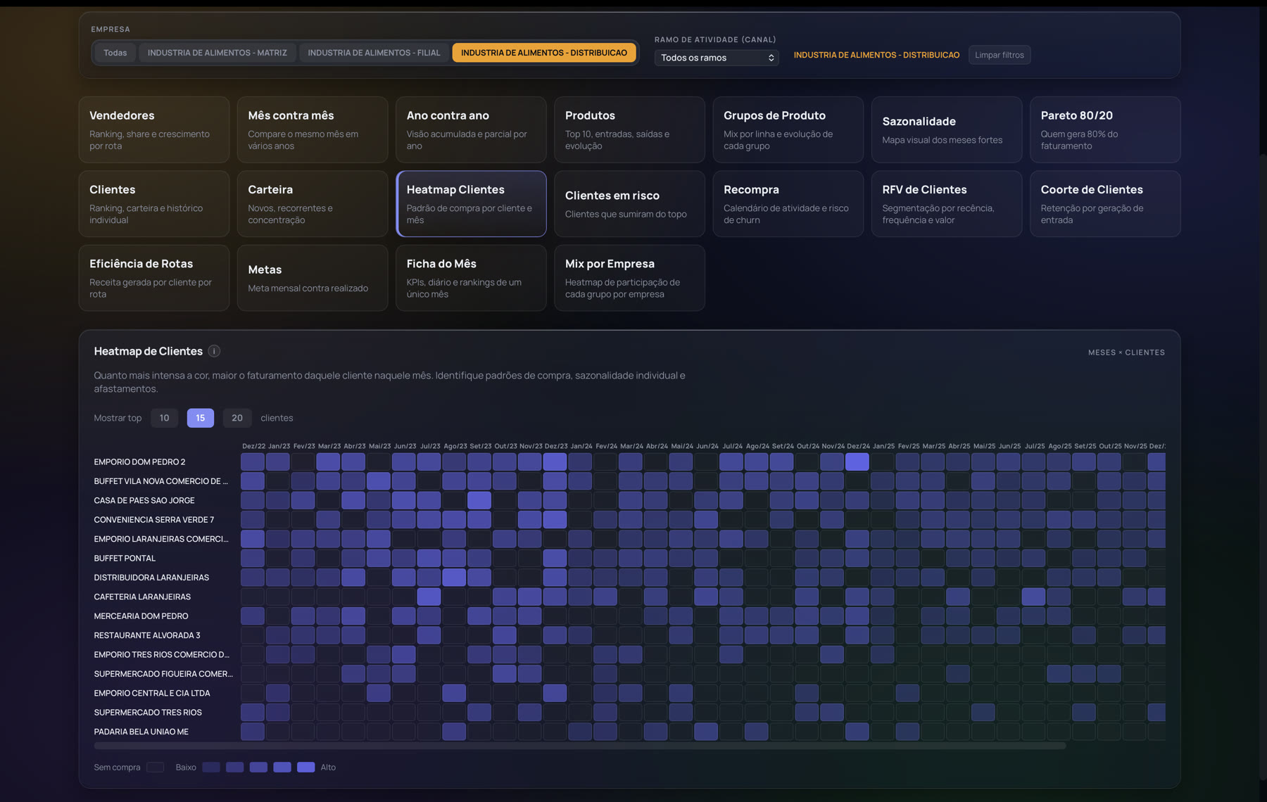
The heatmap shows when each client bought over the last four years. It is where a disappearance becomes visible: a row that used to be full and went empty is a client who stopped, and nobody had noticed. 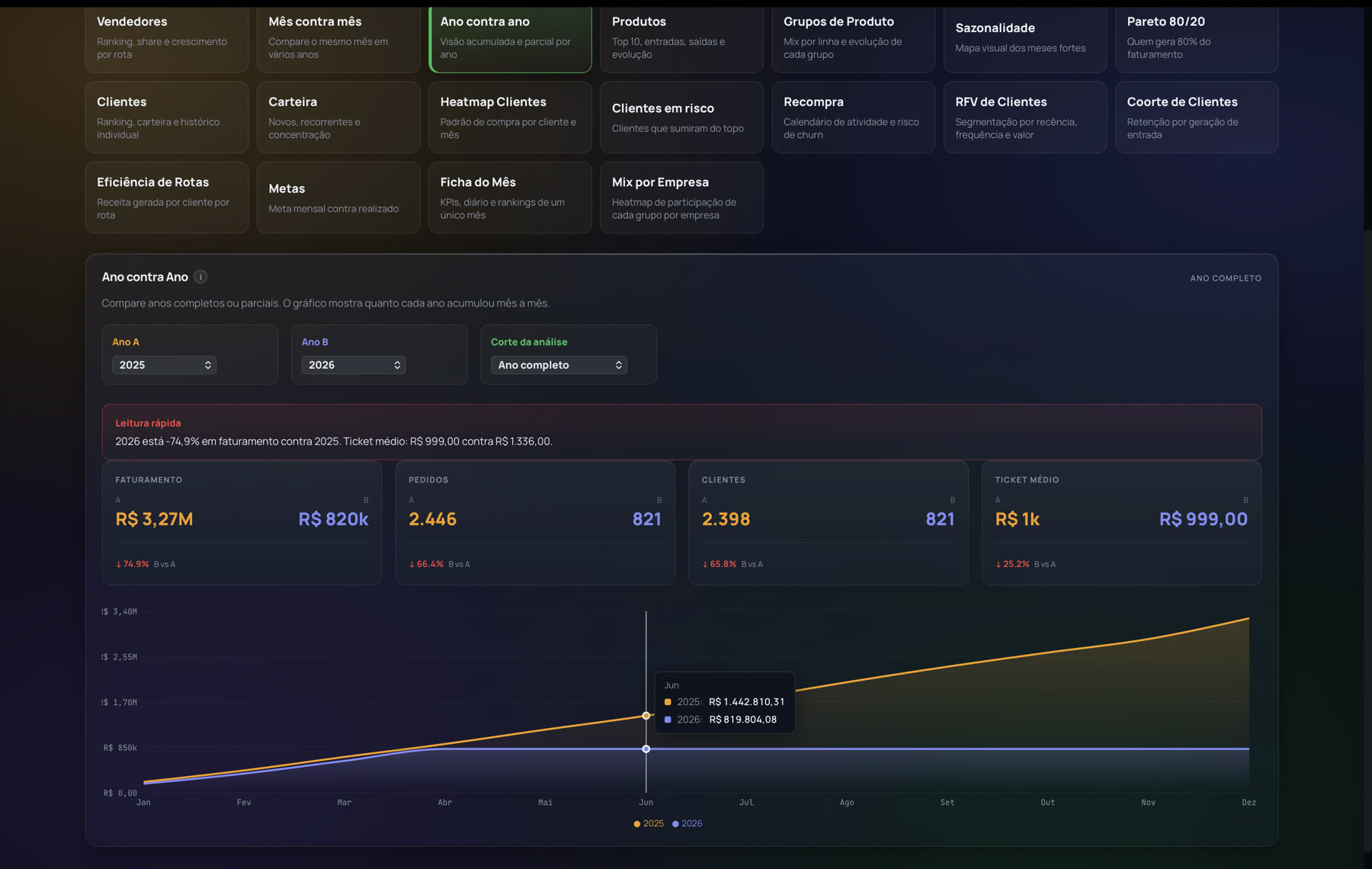
The comparisons come ready with the reading already written on top. The board does not have to build the calculation or remember what it is comparing against: pick the two years and read the sentence. 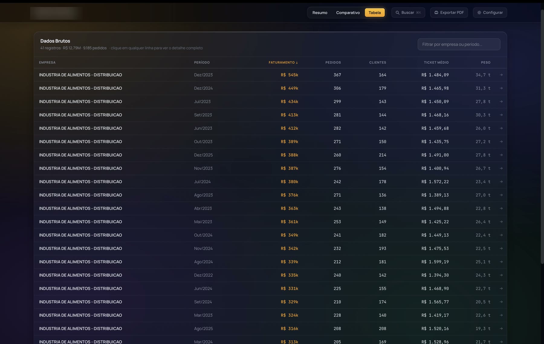
Underneath every chart there is the raw table, sortable and exportable to CSV. A dashboard that only shows charts forces you to trust it; this one lets you check row by row, which is what makes someone stop keeping the parallel spreadsheet.